Last updated: 8 October 2026. Every screenshot below was recorded on 5 and 8 October 2026 on an IQ Option Practice account registered in Brazil, on EUR/USD candles. We placed no real-money trade. The settings and the way the bars are drawn come from the published source code of the platform’s built-in indicators (Quadcode’s script library), and the screenshots show them as recorded. This guide has no tested box: the long and short signals are one way of reading the indicator, and the examples show how they look, not how often they work.
Moving Average Deviation (MAD for short in this guide) plots the price minus its moving average as histogram bars around a zero line, in a panel under the price chart: a bar above zero means the price is above its average, and a bar below zero means it is below it. The bar’s colour is a separate signal: it is green when the bar’s value is equal to or higher than the previous bar’s and red when it is lower, so it shows whether the value rose or fell, not whether the price is above or below its average.
Quick answer
- What it plots: the source price minus its moving average, as histogram bars around a zero line, in a panel under the price chart.
- Defaults: period 12; the Source (close) and the Moving Average type (SMA) are on the Basic settings tab.
- Bar position: above zero means the price is above its average, below zero means it is below it.
- Bar colour: green when the bar’s value is equal to or higher than the previous bar’s, red when it is lower. It is not a price-up or price-down colour: a bar can be red while the price rises.
- Units: price units, so the same bar height means different things on assets with different price levels. The IQOW Price EMA Distance Percent script plots the distance as a percentage of an EMA instead.
- Rules in this guide: long and short signals built on the bars and an SMA 12. They have no candle size and no expiry, and they are not tested here.
Moving Average Deviation on the IQ Option platform
The indicator’s full name is Moving Average Deviation. This guide shortens it to MAD. It is in the Moving Averages group of the Chart analysis panel, and it opens in its own panel below the price chart, with bars drawn from a zero line.
Set the chart
Choose the asset, the chart type and the candle size first: the indicator is calculated from the candles on the chart. The examples in this guide use 5-minute candles on EUR/USD. These steps use the web traderoom on a Practice balance, and the numbers in each screenshot match the numbers in the text. If you do not have an account yet, see how to register.
Step 1: Open Chart analysis
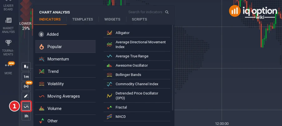
Click the indicators button (1), the wave icon in the chart toolbar at the bottom left of the chart. The Chart analysis panel opens with the tabs Indicators, Templates, Widgets and Scripts. Stay on Indicators.
Step 2: Find Moving Average Deviation
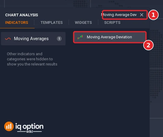
Type “Moving Average Dev” (or “deviation”) in the Search for indicators box (1) or open the Moving Averages list, and click Moving Average Deviation (2).
Step 3: Check the settings
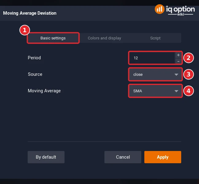
The dialog has three tabs: Basic settings (1), Colors and display and Script. On Basic settings the Period (2) opens at 12, which means that the average is taken over the last 12 candles. The Source (3) is the price that is compared with the average and opens on close. The Moving Average (4) is the type of average and opens on SMA, a simple moving average. The panel header then reads Moving Average Deviation (12,close,SMA).
Step 4: Check the bar colours and click Apply
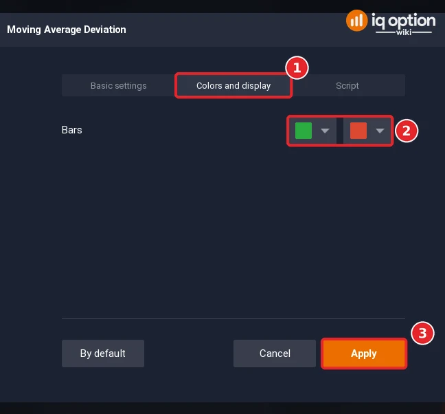
Open the Colors and display tab (1). It has one row, Bars, with two colour lists (2), green and red. In the published source code the bar is green when its value is equal to or higher than the previous bar’s and red when it is lower. Click Apply (3).
Step 5: Read the panel
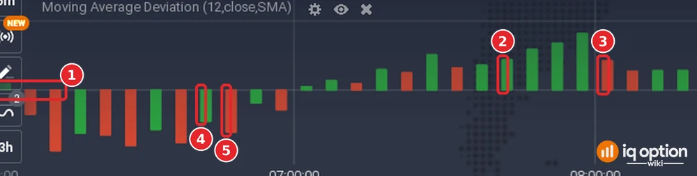
The indicator appears in a separate panel under the price chart. The line at zero (1) is where the price equals its moving average. A bar above zero is green or red depending on the previous bar: (2) is a green bar above zero, (3) a red bar above zero, (4) a green bar below zero and (5) a red bar below zero.
How do you calculate Moving Average Deviation?
Each bar is the source price minus the moving average of that price over the period: bar = source − moving average. With a Close source and a Simple average, the bar is the close minus its 12-period simple moving average. If the value is positive, the bar is drawn above the zero line, and if it is negative, below it. The bars therefore sit above zero when the price is above its moving average and below zero when it is below. They are in price units, so a bar’s height depends on the price level of the asset.
The colour compares each bar with the one before it: the bar is green when its value is equal to or higher than the previous bar’s value, and red when it is lower. Together, position and colour give four cases:
| Bar position | Bar colour | What it means |
|---|---|---|
| Above zero | Green | The price is above its average and the distance above it grew or stayed the same. |
| Above zero | Red | The price is still above its average, but the distance above it shrank. |
| Below zero | Green | The price is still below its average, but the distance below it shrank (the bar is less negative than the one before). |
| Below zero | Red | The price is below its average and the distance below it grew (the bar is more negative than the one before). |
The colour does not show whether the price is rising or falling. It follows the bar’s value, and the average moves too: if the average rises faster than the price, a bar turns red while the price is still going up, and a bar can be green while the price falls. Read the colour as “the distance rose or fell”, and the position of the bar as “which side of the average the price is on”.
Is Moving Average Deviation the same as EMA?
No. The EMA is a moving average: one line on the price chart. MAD is the distance between the price and a moving average, drawn as bars in its own panel. The two meet in one place: if you set the Moving Average setting of the MAD to EMA, the bars show the distance from an EMA. See the EMA guide for the line itself.
Trading with Moving Average Deviation
The long and short signals below pair MAD with a simple moving average on the price chart, also with the period 12. With a Close source and a Simple average, a bar above zero means that the close is above the SMA 12, so the zero line of the histogram and the SMA 12 on the price chart mark the same crossing. The line on the chart adds one thing: it lets you see where the whole candle, not only its close, sits against the average.
Step 6: Add the SMA 12 to the price chart
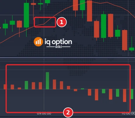
Click the indicators button, open Moving Average as in steps 1 and 2, set the Type to SMA and the period to 12, and click Apply. The SMA 12 (1) now runs through the candles in the main chart, and the MAD panel (2) sits under it.
MAD Signals to go long
The long rule has three steps (green means the bar’s value is equal to or higher than the previous bar’s, red means lower):
- Trend side. The bars are above zero and the candles are developing above the SMA 12. Green bars one after another mean that the distance above the average keeps growing.
- The correction. Wait for one or more red bars above zero. The distance above the average is shrinking: price is pulling back toward its average, or the average is catching up.
- The entry. Enter at the first green bar after the red ones. The distance is growing again. A bar is final only when its candle has closed, so the entry is at the close of the candle whose bar is the first green one.
The rule keeps the position open until the candlestick crosses the SMA 12 on the way down. That is an exit for a margin (CFD) trade, which you can close at any time and which can have a stop loss and a take profit. A binary option closes at its expiry, so it needs an expiry instead. The rule names no expiry and no candle size. This guide does not test the rule: the example shows what it looks like on one chart, not how often it works. IQ Option’s blog on backtesting says that most strategies need dozens, and often hundreds, of trades before a result means anything.
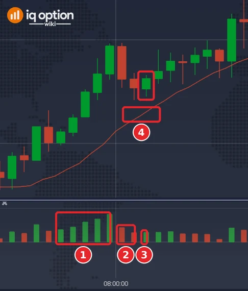
On EUR/USD 5-minute candles, five green bars above zero come in a row, from 07:35 to 07:55 on 29 September 2026 on the platform clock (1): the distance above the SMA 12 grows from 0.000362 to 0.000823. Two red bars above zero follow, at 08:00 and 08:05 (2): the distance shrinks to 0.000425 and then 0.000271. The candle that opened at 08:10 (11:10 UTC) has the first green bar after them, 0.000282 (3). It closed at 1.13462, above the SMA 12 at 1.13434 (4). That is the entry of the long rule. We do not say how a trade from here would have ended, because the rule names no expiry. Values are from a replay of the recorded candles.
MAD Signals to go short
The short rule is the mirror image:
- Trend side. The candles are developing below the SMA 12 and the bars are below zero. Red bars one after another mean that the distance below the average keeps growing.
- The correction. Wait for one or more green bars below zero. The distance below the average is shrinking: price is rebounding toward its average, or the average is catching down to price.
- The entry. Enter at the next red bar. The distance below the average is growing again.
The short rule closes the trade when the candlestick crosses the SMA 12 on its way up. The same note applies as for the long rule: that is an exit for a margin (CFD) trade, a binary option needs an expiry, and none is given.
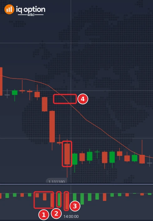
On the same chart type, three red bars below zero come in a row at 13:35, 13:40 and 13:45 on 29 September 2026 on the platform clock (1): the distance below the SMA 12 grows from −0.000301 to −0.001067. One green bar follows at 13:50 (2): the value rises to −0.000977, so the distance shrinks a little. The candle that opened at 13:55 (16:55 UTC) has a red bar again, −0.001240 (3). It closed at 1.131455, under the SMA 12 at 1.132695 (4). That is the entry of the short rule, and the trade is not followed to an end here either. Of the few clean examples in the stretch we recorded, this is the first one in which every bar of the run is larger than 0.0002; we picked it for how clearly the bars show, not for how it ended.
Pros and Cons of Moving Average Deviation (MAD)
| Pros | Cons |
|---|---|
| It shows in one panel how far the price is from its moving average, with a zero line where the two are equal. | It is built on a moving average, so it lags. IQ Option’s blog says a moving average cannot predict the direction or the strength of the next move. |
| The bar colour adds a second reading: whether the value rose or fell against the previous bar. | The colour is easy to misread as price direction. A bar can be red while the price rises, and green while it falls. |
| It has few settings (period, source, average type) and two bar colours. | The bars are in price units, so their heights cannot be compared across assets with different price levels. |
| The Moving Average setting is a list of average types, the EMA among them (as on the Moving Average indicator’s Type list). | When price keeps crossing its average, the bars flip between the sides of zero, and IQ Option’s blog says that in a sideways market such crossings give no clear direction and signals can be false. |
Comparison Between Moving Average Deviation (MAD) and Exponential Moving Average (EMA)
The two are not rivals: one is a line, the other measures the distance from a line.
| Feature | Moving Average Deviation | Exponential Moving Average |
|---|---|---|
| What it plots | The source price minus its moving average | The moving average itself, with bigger weights on recent prices |
| Where it appears | In its own panel under the price chart | On the price chart |
| Zero line | Yes: zero means the price equals its average | No |
| Unit | Price units, so the height depends on the asset’s price level | Price |
| Colour | Bars: green if the value is equal to or higher than the previous bar’s, red if lower | One line colour that you choose |
| Settings | Period, Source, Moving Average, bar colours | Type (set to EMA), period, source, line colour |
| Combined | Yes: set the Moving Average to EMA and the bars show the distance from an EMA | Yes: put the line on the chart next to the panel |
Distance as a percentage of an EMA
Because the built-in MAD is in price units, the same bar height means something different on an asset with a low price than on one with a high price. The script library has IQOW Price EMA Distance Percent, a context script that plots the distance between the price and an EMA as a percentage of the EMA, in its own panel. Its default EMA period is 20, and it draws a reference zone at plus and minus 1% that you can change. Above zero means the price is above its EMA. The script says no more than that: the library’s own notes say that a distance from an average does not imply a reversal and that a stretched reading can stay stretched in a strong trend. It places no trades and gives no signals. The built-in MAD shows a similar distance, but in price units and with the average type set by its own Moving Average setting (SMA by default).
Summary
Moving Average Deviation draws the price minus its moving average as bars around a zero line. The position of a bar says which side of its average the price is on, and its colour says whether the bar’s value rose or fell against the previous bar. Add an SMA 12 to the price chart to see the same average that the bars use. The long and short rules are one way of reading the indicator; they have no candle size and no expiry, and they are not tested. Try the indicator on the Practice balance, and look at a few dozen bars before you build a rule on it.
Common mistakes
- Reading green as “price is rising”. Green means the bar’s value is equal to or higher than the previous bar’s. Check the position of the bar as well.
- Comparing bar heights across assets. The bars are in price units.
- Changing the period or the average type halfway through a test. IQ Option’s blog on backtesting says rules must stay fixed from start to finish.
- Using a margin exit on a binary option. Closing the trade when a candle crosses the SMA 12 is possible on a CFD. A binary option closes at its expiry.
Related guides
- ALMA and LSMA on IQ Option, moving average on IQ Option and the simple moving average
- The EMA indicator and the 1-minute SMA 8/21 strategy
- Trade entry signals on IQ Option and expiry times
- IQOW Price EMA Distance Percent script in the script library
- All indicator guides and all strategy guides
Frequently Asked Questions
Q: What is the main purpose of the Moving Average Deviation (MAD)?
A: It shows how far the price is from its moving average. Each bar is the price minus the average: above zero when the price is above the average and below zero when it is below.
Q: What do the green and red bars mean?
A: Green means that the bar’s value is equal to or higher than the previous bar’s value, and red means that it is lower. The colour does not show whether the price is rising or falling, and it does not show whether the bar is above or below zero.
Q: Can MAD be used with other technical indicators?
A: Yes. The long and short signals above pair it with an SMA 12 on the price chart. IQ Option’s blog prefers indicators from different groups to several of the same kind, and says that too many lines make signals unclear. Test any pair on a Practice balance before you rely on it.
Q: How does Moving Average Deviation (MAD) differ from the Exponential Moving Average (EMA)?
A: The EMA is a line on the price chart. MAD is the distance between the price and a chosen moving average, drawn as bars in a separate panel. If you set the Moving Average setting of the MAD to EMA, the bars show the distance from an EMA.
Q: Is MAD suitable for all market conditions?
A: No source says so. MAD is built on a moving average, and IQ Option’s blog says that when price crosses a moving average again and again the market has no clear direction, and that crossovers can give false signals in sideways markets.
Q: What are the default settings of MAD?
A: Period 12, source close and Moving Average SMA, as the dialog showed on 5 October 2026.
Q: Is there a version that shows the distance in percent?
A: Yes. The script library’s IQOW Price EMA Distance Percent plots the distance between the price and an EMA (default period 20) as a percentage of the EMA. Import it as shown in our scripts guide.
Q: How can I practice using MAD before incorporating it into my trading?
A: Add it to a chart on the Practice balance, which holds $10,000 and has a Refill to $10,000 button. Change one setting at a time and watch how the bars move against the price.