Last updated: 8 October 2026. Every screenshot below was recorded on 8 October 2026 on an IQ Option Practice account registered in Brazil, on EUR/USD 5-minute candles; the Chart analysis picture in Step 1 was recorded on 5 October 2026. We placed no real-money trade. The colours come from the platform’s dialog and the calculation from the published source code of the platform’s built-in indicators (Quadcode’s script library). This guide has no tested box: there are readings of trend and divergence, not entry rules, so it shows what the line did on recorded candles.
The Accumulation/Distribution line (A/D or ADL) adds up, candle after candle, the volume weighted by where the close lies between the low and the high: a close at the top of the candle adds the whole volume, a close at the bottom subtracts it, and a close in the middle adds nothing. On IQ Option it opens in its own panel under the price chart as one line with no settings to choose. Its level means nothing by itself, because it is a running total from the first candle loaded; only its direction and its agreement with the price matter. On 5-minute EUR/USD candles, the change of the line over 12 candles had the same sign as the change of the price on 80% of the candles.
Quick answer
- What it plots: one line in a panel under the price chart, with no numeric settings; the dialog only changes the colour and width of the line.
- Formula: CLV = ((close − low) − (high − close)) ÷ (high − low), from −1 to +1; A/D = the previous A/D + volume × CLV.
- Reading: a rising line means closes near the highs with volume (accumulation), a falling line closes near the lows (distribution). It is used to confirm a trend and to spot divergences.
- Volume on a forex chart: IQ Option’s blog says it may count ticks or the activity of one data source, not all trading.
- Where: the Volume list of the Chart analysis panel; search for Accumulation.
- Not tested here: the trend confirmation and the divergences are explained and measured, not tested as entry rules.
How do you add the Accumulation/Distribution on IQ Option?
Set the chart
Choose the asset, the chart type and the candle size first: the indicator is calculated from the candles on the chart. The examples in this guide use 5-minute candles on EUR/USD. These steps use the web traderoom on a Practice balance, and the numbers in each screenshot match the numbers in the text. If you do not have an account yet, see how to register.
Step 1: Open Chart analysis
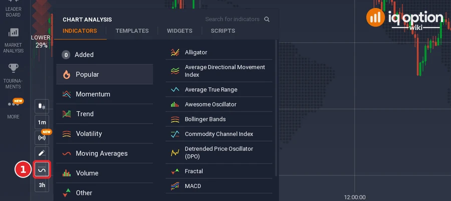
Click the indicators button (1), the wave icon in the chart toolbar at the bottom left of the chart. The Chart analysis panel opens with the tabs Indicators, Templates, Widgets and Scripts. Stay on Indicators.
Step 2: Find Accumulation/Distribution
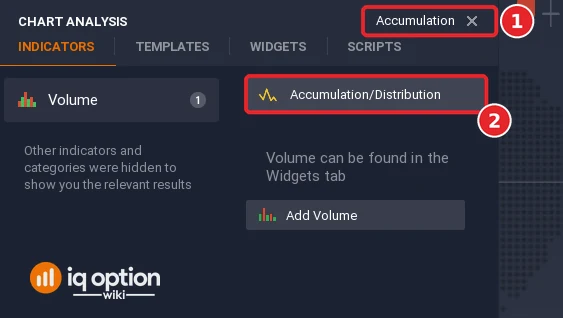
Type “Accumulation” in the Search for indicators box (1), or open the Volume list, and click Accumulation/Distribution (2).
Step 3: Check the colours and click Apply
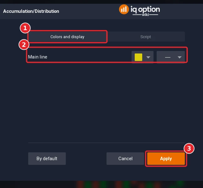
The dialog has only two tabs, Colors and display (1) and Script, because the indicator has no settings, and it opens on the colours. It has one row, Main line (2), with a colour box, yellow by default, and a line-style box. Click Apply (3).
Step 4: Read the panel
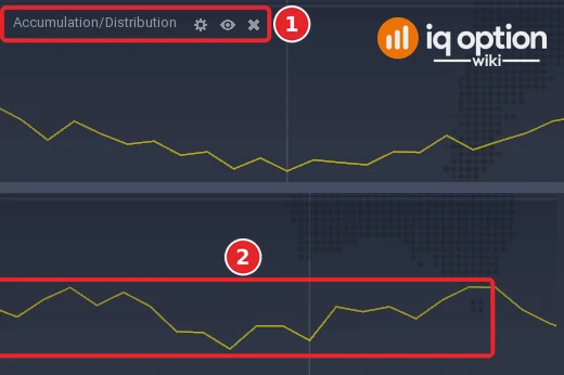
The panel under the price chart is titled Accumulation/Distribution (1) and holds one yellow line (2). It has no scale and no level line: only the direction of the line and its turns matter, not its level.
How is the Accumulation/Distribution line calculated?
The Quadcode source computes, on every candle, a close location value: CLV = ((close − low) − (high − close)) ÷ (high − low). It is +1 when the close equals the high, −1 when it equals the low and 0 when the close is in the middle of the candle. The money flow volume of the candle is the volume times the CLV, and the A/D line is the running total: each candle adds its money flow volume to the value of the candle before.
The line rises when a high positive multiplier is joined by high volume, and a strong selling pressure, a low negative multiplier with high volume, lowers it. The line is read as the accumulated flow of volume and as a way to confirm or contradict the trend on the price chart.
Two things follow from the formula. The line has no scale of its own: it is a running total, so its level depends on how many candles the platform has loaded, and only its slope and its turns carry information. And it uses the close position only: a candle that closes at the high adds its whole volume even if it was a very small candle.
How do you read the Accumulation/Distribution line?
There are two readings. Trend confirmation: when the price and the A/D line move in the same direction, the trend is confirmed: both rising is an uptrend, both falling a downtrend. Divergence: when they move in different directions, a change of trend is expected: the price falls while the line rises (bullish divergence, underlying buying pressure), or the price rises while the line falls (bearish divergence, underlying selling pressure). The indicator is not a standalone tool; moving averages, momentum oscillators, the RSI and Bollinger Bands are the usual partners.
The volume on a forex or currency chart needs care. IQ Option’s blog says that the volume on a retail chart may represent ticks or the activity of one data source, not all trading in the market. The A/D line therefore shows the flow of the volume that the platform has, which may not be the volume of the whole market.
What did it look like on 5-minute candles?
We replayed the library script on EUR/USD 5-minute candles recorded from the Practice traderoom: 1,093 candles from 29 September 2026 (01:55 UTC) to 2 October (20:55 UTC) and 241 from 4 October (21:00 UTC) to 5 October (17:00 UTC). Each stretch starts the line at zero, so the two stretches have separate scales.
- Level: in the first stretch the line went from about +700 to −61,600 (its lowest value was −74,100 and its highest +2,900) while EUR/USD fell from 1.1367 to 1.1257; in the second it ended at −3,500.
- Agreement with the price: the change of the line over 12 candles had the same sign as the change of the price over the same 12 candles on 1,050 of 1,308 candles (80%). So a confirmation is the normal state, and a divergence the exception, 20% of the time on this pair and candle size.
Two stills of the platform, window A (the Step 5 picture) and window B (not pictured), agree with the replay, point for point, to within about a pixel. In window A, 29 September from 05:56 to 11:45 on the platform clock, the line sinks to a low at 07:00, climbs to the high of the window at 09:05 and falls back to a second low at 10:45. In window B, from 11:17 to 17:02, it reaches its high at 11:30, falls to a low at 14:00, and after a jump at 15:05 moves sideways. The replay of the library script gives the same highs and lows in the same candles (A: −10,342 at 07:00, −2,749 at 09:05, −9,432 at 10:45; B: −5,644 at 11:30, −13,268 at 14:00), which also shows that the candles and volumes of our recording are the ones the platform draws. The platform’s own values are different because its running total starts earlier, and the panel shows no scale. (The platform draws the value of a candle at the time the candle closes: the candle that opened at 08:00 sits at the 08:05 mark.)
Pros and Cons of the Accumulation/Distribution line
| Pros | Cons |
|---|---|
| One line, no settings: nothing to tune or to get wrong. | The level depends on how many candles the platform has loaded; only the slope and the turns count. |
| Adds volume to the picture, which a price-only indicator ignores. | On forex the volume on a retail chart may be ticks or one data source’s activity. |
| Divergences with the price give a reason to look closer at a trend. | A divergence is judged by eye, and a trend can continue for a long time after one. |
Common mistakes
- Comparing the level on two charts. The line is a running total from the first loaded candle, so its level changes with the history; compare slopes.
- Reading every difference as a divergence. The line and the price disagreed on only 20% of the 12-candle windows in our recording, but a small wiggle is not a divergence.
- Trading it alone. It is not recommended as a standalone tool.
- Forgetting what volume is on forex. IQ Option’s blog says it may be ticks or one data source’s activity.
Related guides
- How to read trading volume and Volume Oscillator and Net Volume
- Weis Wave Volume and classic and hidden divergences
- Identifying a trend and leading and lagging indicators
- All indicator guides and all strategy guides
Frequently Asked Questions
Q: What is the Accumulation/Distribution indicator?
A: A running total of the volume of each candle, weighted by where the close lies between the low and the high. It rises when closes are near the highs with volume and falls when they are near the lows.
Q: What settings does the Accumulation/Distribution have on IQ Option?
A: None. The indicator has no numeric settings; the dialog only has one row, Main line, for the colour and the line style.
Q: What does a divergence mean?
A: A price that falls while the line rises is read as buying pressure under the surface, and a price that rises while the line falls as selling pressure, and a change of trend is expected. It is a reading made by eye, and it is not tested here.
Q: Why does the line start at zero?
A: It is a running total from the first candle the platform has loaded, so its level depends on the history; only its direction matters.
Q: Is the volume real on forex?
A: IQ Option’s blog says the volume on a retail forex chart may represent ticks or the activity of one data source, not all trading.
Q: Can I use it on binary options?
A: The platform draws it on any chart that has volume. Whether a rule built on it works is something to test on the Practice balance with the expiry you plan to use.