Last updated: 8 October 2026. Every screenshot below was recorded on 8 October 2026 on an IQ Option Practice account registered in Brazil, on EUR/USD 5-minute candles; the Chart analysis picture in Step 1 was recorded on 5 October 2026. We placed no real-money trade. The settings come from the platform’s dialog and the calculation from the published source code of the platform’s built-in indicators (Quadcode’s script library). This guide has no tested box: the Ulcer Index gives no trading signals, so it shows what the line did on recorded candles.
The Ulcer Index measures how far the price has fallen from its recent highs. On every candle it takes the percentage drop of the close from the highest close of the last 14 candles, squares it, averages the squares over 14 candles and takes the square root. On IQ Option it opens in its own panel under the price chart as one line that is never below zero: it is low while the price keeps making new highs and rises as the price falls and fails to recover. It is a risk measure for long-term investors and gives no trading signals. On 5-minute EUR/USD candles its median was 0.054%, and when it was in its highest tenth the price had fallen over the last 14 candles on 91% of the candles.
Quick answer
- What it plots: one line in a panel under the price chart, never below zero.
- Formula: drawdown = 100 × (close − highest close of n candles) ÷ highest close; Ulcer Index = the square root of the average of the squared drawdowns over n candles. The default n is 14.
- Settings on the platform: Period 14 and Source (close).
- Reading: a rising line means a growing drawdown from the recent highs; a falling line means the price is recovering or making new highs. It has no direction and no levels.
- Where: the Other list of the Chart analysis panel; search for Ulcer.
- Not tested here: there is no entry rule for it, and it is not meant to give trading signals.
How do you add the Ulcer Index on IQ Option?
Set the chart
Choose the asset, the chart type and the candle size first: the indicator is calculated from the candles on the chart. The examples in this guide use 5-minute candles on EUR/USD. These steps use the web traderoom on a Practice balance, and the numbers in each screenshot match the numbers in the text. If you do not have an account yet, see how to register.
Step 1: Open Chart analysis
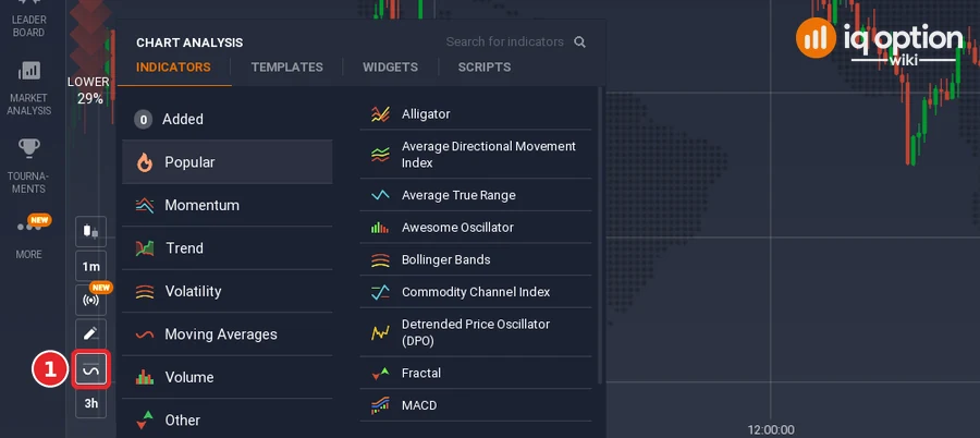
Click the indicators button (1), the wave icon in the chart toolbar at the bottom left of the chart. The Chart analysis panel opens with the tabs Indicators, Templates, Widgets and Scripts. Stay on Indicators.
Step 2: Find Ulcer Index
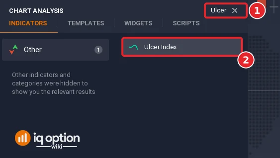
Type “Ulcer” in the Search for indicators box (1), or open the Other list, and click Ulcer Index (2).
Step 3: Check the settings
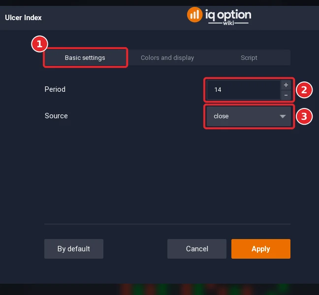
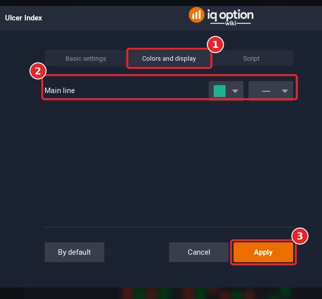
The dialog has the tabs Basic settings (1), Colors and display and Script. The Period (2) opens at 14, the number of candles for the highest close and for the average. The Source (3) opens at close, the price whose drawdown is measured.
Step 4: Check the colours and click Apply
Open the Colors and display tab (1). The tab has one row, Main line (2), with a colour box, green by default, and a line-style box. Click Apply (3).
Step 5: Read the panel
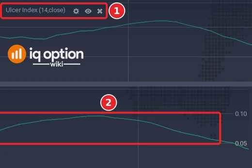
The panel under the price chart is titled Ulcer Index (14,close) (1). It holds one green line (2) and a scale at its right edge with marks such as 0.05 and 0.10, in percent.
How is the Ulcer Index calculated?
The Quadcode source works in three steps. For every candle it finds the highest value of the source (the close) over the last n candles, 14 by default, and computes the percentage drawdown: 100 × (close − highest) ÷ highest, which is zero or negative. It squares the drawdown and averages the squares over the same n candles with a simple moving average, and the Ulcer Index is the square root of that average. Squaring makes a deep drawdown count much more than a shallow one, and the root brings the value back to percent.
| Part | Default | What it does |
|---|---|---|
| Period | 14 | Number of candles for the highest close and for the average |
| Source | Close | The price used |
The usual description gives the same steps and explains the name: the index looks only at the downside, which is the most stressful part of a price move for a trader. The index is zero when every close is a new high; in the platform’s formula that happens only if all of the last 14 closes are higher than the one before.
How do you read the Ulcer Index?
There are three usual readings. First, the value rises when the downside risk grows and the price cannot return to its previous highs, and it falls when the price makes new highs. Second, the line reaches its local maximums most often when the price chart reaches a bottom. Third, the market usually rises while the index falls, and vice versa, which is said to help decide when to exit an open position; if the average peaks of the index are broken, the price is likely to keep falling. The Ulcer Index is a complement to other tools and cannot make a strategy on its own, and it is mainly used by long-term investors on daily charts and above.
The line says nothing about the direction of the next candle. It says how deep the price is below its recent highs.
What did it look like on 5-minute candles?
We replayed the library script on EUR/USD 5-minute candles recorded from the Practice traderoom: 1,093 candles from 29 September 2026 (01:55 UTC) to 2 October (20:55 UTC) and 241 from 4 October (21:00 UTC) to 5 October (17:00 UTC). With the default period the line has a value from the 27th candle of each stretch, 1,282 values in all.
- Typical values: median 0.054%; the middle 80% of the values lay between 0.015% and 0.138%; the lowest was 0.002% and the highest 0.380%.
- Highest peak of the first stretch: 0.346% on 1 October at 13:00 on the platform clock (16:00 UTC), when the close was 34 pips below the highest close of the previous 14 candles. The lowest close of that move came one candle earlier, and six candles after the peak the close was 6 pips above the close of the peak candle.
- With the price: the price had fallen over the last 14 candles on 56% of all candles, and on 91% (117 of 129) of the candles where the Ulcer Index was in its highest tenth.
Two stills of the platform, window A (the Step 5 picture) and window B (not pictured), agree with the replay. In window A, 29 September from 05:56 to 11:45 on the platform clock, the line peaks at 0.111% at 07:15, falls to a flat low of about 0.017% from 08:25 to about 09:05, climbs to 0.096% at 10:40 and falls again. In window B, from 11:17 to 17:02, it peaks at 0.085% at 13:05 and at 0.137% at 14:50, then falls to 0.013% at 16:10, stays under 0.017% until 16:45 and ends at 0.023%. Read off the panel at 131 points of the two windows, the line differed from the replay of the library script by 0.0002 percentage points on average in window A and 0.001 in window B, which also shows that the panel’s scale is in percent.
Pros and Cons of the Ulcer Index
| Pros | Cons |
|---|---|
| Measures only the downside, in percent, so the values are easy to compare between periods. | It gives no signals and no direction. |
| Squaring the drawdowns makes a deep fall count far more than several small dips. | On a 5-minute chart the values are tiny (a median of 0.054%), so the scale matters more than the level. |
| Useful to compare how rough two periods or two assets were. | It is mainly meant for daily charts and above. |
Common mistakes
- Reading a peak as a buy signal. Peaks often come at price bottoms, and the highest peak of our first stretch did come one candle after the lowest close of that move; but a peak is only known after the line has turned, and nothing in the line says how far the price will rebound.
- Expecting levels. The line has no fixed overbought or oversold levels; compare it with its own recent history.
- Using it to pick the direction. It never says whether the next candle will be up or down.
- Comparing values across assets without care. The scale depends on the volatility of the asset and the candle size.
Related guides
- Relative Volatility Index and Keltner Channel
- Chaikin Volatility and money management
- Leading and lagging indicators and too many indicators on your chart
- All indicator guides and all strategy guides
Frequently Asked Questions
Q: What is the Ulcer Index?
A: An indicator of downside risk: the square root of the average squared percentage drawdown of the close from its highest value of the last n candles.
Q: What settings does the Ulcer Index have on IQ Option?
A: Period 14 and Source set to close. The Colors and display tab has a colour and a line style for the line.
Q: Why is it called the Ulcer Index?
A: It looks only at the downside movements, which are the most stressful for traders and may cause stomach ulcers.
Q: Does the Ulcer Index give buy and sell signals?
A: No. It is not an indicator that generates trading signals; it complements other tools.
Q: Does it work on 5-minute charts?
A: It draws and has values on any chart. Daily charts and above are the usual use; on 5-minute EUR/USD candles the values were small, with a median of 0.054%.
Q: Can I use it on binary options?
A: The platform draws it on any chart. It describes how far the price is below its recent high, so it can help to judge how rough a period was, but a rule built on it has to be tested on the Practice balance.